If you’re on twitter and follow som mapping / geo folks, you probably remember this tweet comparing a few popular web and mobile mapping platforms. The tweet, starred and retweeted dozens of times, was broadcast in the wake of the release of Apple Maps last month. Folks were criticizing Apple for moving away from Google as their map provider and settling for maps that seemed far inferior.
Here’s the visual comparison from the tweet:

There’s no doubt that Google Maps has the most detail for this area, which is part of the Bowling Green State campus in Ohio. OpenStreetMap, also included in the comparison, shows a few buildings and POI but is generally not much better than the other non-Google map providers.
Well – that was a month ago.
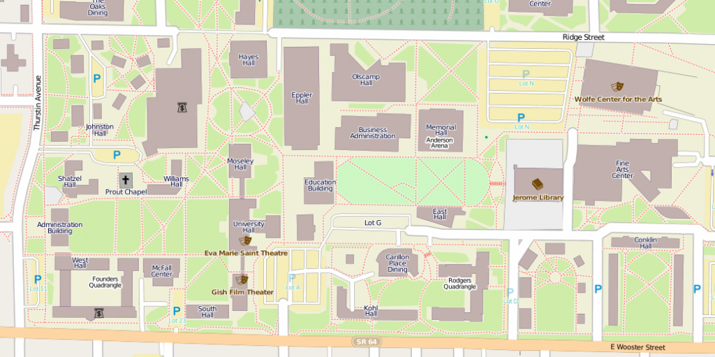
When I first saw this tweet back in September, I looked up the area in OpenStreetMap, and already then, the tweet hot off the press, I noticed a flurry of recent edits on the Bowling Green campus and around it. And here we are now:
Clicking on the image above will take you to OpenStreetMap and if you look around, you will notice that not only the campus area has gained a lot of detail, but also the area around it.
So what does that tell us? First, the comparison for that particular area looks very different even a few weeks later, with OpenStreetMap being the superior alternative now. But also, if you want a better map of your campus, just tick off the OpenStreetMap community by posting a comparison like this, and wait.
Or join the OpenStreetMap community , and do it yourself. It’s a lot of fun and we’d love having you!


